My Quite Swell Blog
Wednesday, January 16, 2013
Tuesday, January 15, 2013
Wednesday, January 9, 2013
Sphere Progress: Day 5
Not a whole lot to say- I've been trying to change colors but it's not working how I'd like it to. Here's what it looks like today:
Finished Project: Light Rays
First I opened a new Photoshop document that was 500 x 500 pixels. I made the background layer black then created a new layer and made it white. I then when to Filter-Render-Clouds, afterwards I went to Filter-Render-Difference Clouds x3.
I then went to Filter-Artistic-Rough Pastels and changed the stroke length to 7, the stroke detail to 15, the texture type to canvas, the scaling to 100%, the relief to 20, made sure it wasn't inverted and made sure the direction was bottom.
On the same little pop up, I clicked on brush strokes and chose accented edges and changed the edge width to 2, the edge brightness to 38, and the smoothness to 5.
I clicked ok and then went to Filter-Distort-Polar Coordinates and made sure it was Rectangular to Polar. My image looked like this:
Go back to Polar Coordinates and change it from Polar to Rectangular.
| I then changed the hue to 12, saturation to 50 and checked
colorize. I then duplicated the layer and made the duplicated layer 50%
opacity and then went to Filter-Blur-Gaussian Blur. And this is my finished product! |
Monday, January 7, 2013
Sphere Progress: Day 4
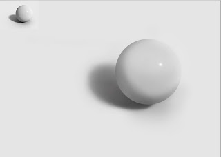
I'm slowly but surely getting closer to the image in the top corner of the bottom picture but it's not quite there. Next class I'll work on more of the darkness of the side of the sphere and it's shadows, hopefully it'll be done soon. Today all I did was lighten the middle of the sphere and made sure to neaten up the shadow. It looks like a real ball and not just a flat ball if that makes sense. Everytime I work on it, it gets closer and closer. If it's not done next class then it will be in the class after that.
Final Project: Brilliant Light Streaks
For my second final project I used the brilliant light streaks tutorial. It looks weird but it was fun to do. I used the wave and twirl tool in "Distort" under Filter. The tutorial said to use one or the other but I thought combining them would look more interesting. I liked the colors but I wish the middle of the swirl wasn't quite so blurry because it would look better if it was sharper.
Final Project: Abstract Background
For one of my three final project things I did the abstract background of colored lines. I chose red and decided it looked like a candy cane, hence the text. I didn't follow the tutorial exactly but I figure that wasn't necessarily a bad thing because it was just more me and less Mr. Tutorial Guy. I surprised myself with this one because I knew where most of the tools were.
Subscribe to:
Comments (Atom)


